Safety at Outdoor Events
I went to an awesome concert last night. Vincent McMorrow played at the Chevron Festival Gardens in Perth. Throughout the evening I enjoyed the music, venue and great atmosphere. But before and during the concert, I couldn’t help notice the other concert goers and imagine how mixed reality might improve everyone’s future experiences.
Crowd safety and security
I don’t like the term crowd control. It makes it sound like you’re herding cattle or something. I think what we’re all aiming for, as concert attendees and staff, is crowd safety. I’ve been to quite a few concerts and dance parties in Australia and overseas. It’s great being up the front, dancing near the DJ or band, in the thick of it among all the other enthusiastic fans. But it can get hectic at times and I’m short. On more than one occassion the crowd has surged forward and I’ve felt a sense of panic and claustrophobia. Thankfully, those moments have only lasted a few seconds. But others are not so lucky. Sometimes it’s not the crowd en masse that presents a potential danger but a one off situation. Two guys start a fight. Someone faints. Someone else climbs the lighting rig at Alison Wonderland’s secret warehouse party (seriously dude, not cool). In those instances, venue staff have to get to those people and quickly. But it’s not that easy.
Firstly, someone has to alert staff to what’s going on. A staff member has to make their way to that spot. Then they have to assess the situation. They might have to administer first aid. If they need additional help, they have to call for other staff and explain where they are located. If people have to be moved, they need to clear a path through the crowd.
Essentially, what we’re trying to improve is communication between security, first aid responders and the audience. How do we transmit important information between people quickly and efficiently?
A key design consideration is the environment. A concert space is sensory overload. An audience wants to be wowed with amazing visual and audio effects from the artist they’ve come to see. Crowds make a lot of noise and can obscure vision. This all makes it very difficult for venue staff to see and hear (even with headphones) what’s going on around them and to communicate with their colleagues.
How could mixed reality aid communication in situations like these?
I’ve explored some key considerations from the perspective of someone who works at the concert. I’ve mocked up some very simple designs and will take you through my thought process.
Location of an incident
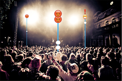
The central element in my design is a totem or navigational pole that pinpoints a potential incident as per the image below. I’ve deliberately taken something from the real world in order to capitalise on an existing system of meaning. That is, it’s easy for people to understand what an object may mean or do in a mixed reality universe because it behaves in a similar way to its real world counterpart. I’m not creating or trying to teach them a whole new system of meaning (not in this case anyhow but there are exceptions).

Design 1. (Original image by Kmero via Flickr.)
So these poles would function just like navigational signs in the real world. They are fixed to one location so that poles in the distance appear smaller than those in the foreground. This might sound very obvious but it’s actually a key difference between augmented reality and mixed reality. Augmented reality would layer these objects statically over your vision. But in mixed reality these poles behave like real objects: they are fixed to a single specific location, remain a fixed size in space, disappear from view when something is placed in front of it and you can approach and walk around them. (Of course you could also adjust any of these properties as the situation required.)
Type of incident
Each totem pole is topped with an emoji which describes the current issue. For example:
The “angry emoji” represents an aggressive person.
Two angry emojis represent a fight between two people.
The “emoji with mask” is a person in need of medical attention.
I’ve used emojis rather than text because I think images and symbols communicate faster than words. I also believe in the KISS principle and feel that text would be unnecessary clutter. If the priority is to get assistance to a location as quickly as possible then we should only communicate pertinent information. Emojis have another advantage over text: they are not bound by language. So two different people can quickly understand the system, and each other, even if they don’t speak the same language. A great idea for large festivals with attendees from different countries.
I’ve steered clear of menus or other complicated UI, and with good reason: it’s difficult to introduce elements to someone’s field of view when they’re mobile (or stationary but their head moves frequently). At Occulus Connect, Patrick Harris (Lead Game Designer at Minority Media) described the difficulties of designing UI for the virtual space. “There are no corners of the screen when you put on an Oculus Rift! That’s not a location that exists… You need to realize that anything in the ‘corner’ is actually [the player’s] peripheral vision.”
So rather than impose a static menu over a person’s vision, mixed reality objects can be more natural because they appear as real objects blending in with the existing environment. But therein lies another problem. Mixed reality elements need to contrast enough so that they are noticeable within the real world environment.
Use of colour
I’ve used a bright orange colour for the totem poles. I could use red and green in the colour palette later but I’d have to be careful not to assign opposing values (on/off, yes/no) that aren’t also distinguishable by symbols or text since that could disadvantage people who are colour blind. However, my mockup quickly revealed that orange is difficult to see against bright stage lights. It might be better to use a brighter colour with stronger contrast against a range of different lighting and potential stage effects (pyrotechnics, cryogenics, flames etc).
In fact, it may be necessary to use mixed reality to occlude vision from those effects before overlaying the totem poles. That is, overlay a dark background and then add the totem poles. (This will be easy to do in the future, as I predict that concerts will have a high degree of mixed reality content in themselves. If so, venue staff could simply opt out of the “concert content stream” and focus on the “venue/security/safety stream”. I’ll explore the notion of mixed reality content streams in a future post.)
Urgency
Based on experimenting and some findings with the first design, I iterated and created an updated version. I’ve changed the pole colour to bright blue which stands out much better.

Design No.2.
So next I wanted to consider: what if multiple incidents are happening simultaneously? How do I know which one is the most urgent? There needs to be a design element to communicate a sense of urgency, allowing staff to prioritise their actions. In the image above, I used solid blue lines for the poles to indicate more serious situations versus dashed lines for less serious situations. But thanks to the mockup I can already see a design flaw: from a distance dashed lines look solid anyway, so you can’t really distinguish between them.
Another way to communicate urgency could be to make the totem poles and emojis flash or animate. But this may still be hard to distinguish against crowd movement, stage lighting and special effects. A single static icon may be the simplest way to express this which I have incorporated as a red exclamation point over the emoji (see image Design No.3 ).
Assigning tasks
With multiple staff on shift, how would I know whether someone was already on their way to deal with a specific incident? My design mock up includes a simple white circle placed at the bottom of the pole to represent a staff member. At first, I included profile images within the circles. But for the sake of simplicity I removed them. I think the important thing is to know that someone is on their way, not who. (This information could always be added later). Multiple people attending an incident is represented by multiple white circles.
I quickly realised that the totem pole design also provides a neat solution to the problem of knowing how far a staff member was from an incident. As the staff member approaches the totem pole, the white circle that represents that individual also moves up the pole. Once the white circle reaches the emoji you know that someone has reached the incident location. And because the totem poles are showing data in real time, you can see how fast someone is moving towards that location.

Design No.3.
Emergency exits
If a patron needed emergency medical attention they might need to be moved out of the crowd or building as quickly as possible. Although venue staff may know exactly where exits are located, it may not be clear how to reach them. Especially if it’s dark, noisy and crowded.
Mixed reality could map the room and obstacles, then indicate the quickest and safest route to the nearest exit. In part this could be done via object recognition but integrating the venue’s floor plan would be ideal. If patrons had access to the venue’s mixed reality content stream, a message could also be transmitted, requesting them to move aside to allow staff to move an injured person. In this way, a mixed reality stream could also serve as a public address system.

Design No.4
UI and feedback
User interface (UI) design for virtual, augmented and mixed reality is a very nascent field. I would like to cover it in more detail in another article but for this present design I will keep things simple. I wish to explore how a user could navigate this information in the context of a concert but omit how the user may input their selection (e.g. eye tracking, hand gestures, voice commands).
Design No.5 presents several key frames in this design:
The user can see all the totem poles at once.
The user activates a “selector tool” that allows them to focus on a particular mixed reality element in their field of view (illustrated via a simple blue crosshair to denote centre of screen) and select that element for further inspection.
Once an element has been selected a dialog box opens with additional detail (nature of the incident, specific requests and profile image of first responder) while all other elements in the field of view are “muted” (they become transparent).
Design No.5
Streams of mixed reality content
In this article I’ve predominantly covered the perspective of venue staff and first aid responders. The various mixed reality elements in this design are focused on providing those individuals with the information they need, at the right time (Just In Time Content). The “stream of content” is for their view only and can be switched on or off. In theory, elements of this stream could be shared with audience members.
As mentioned earlier I believe that mixed reality will become an integral part of future concert experiences. The audience will be privy to a private “stream” through which they can view all the mixed reality content presented by an artist. While venue staff could tune out/opt out of that stream and tune into their own security stream.
However, in emergency situations there could be elements that are made public and shared to all streams like a public broadcast, so that the audience and staff can access the same content. For example, if a fire broke out in one corner of the building a mixed reality interface could:
Trigger an announcement that the concert has stopped and requesting everyone to evacuate the building calmly.
Map safe evacuation routes.
Trigger a “warning” attached to all doors and routes leading to the dangerous area.
Highlight individuals who work at the venue so that they are easily identified.
Allow people who need assistance to “flag” themselves (elderly, parents with young children, physically disabled).
Allow dangerous obstacles or situations to be “flagged”.
Emergency responders could also access this mixed reality content stream to assist their response.
The exact location of the fire could be mapped out on a floor plan but also through mixed reality elements indicating multiple access routes.
Access to information about “flagged” areas indicating potential danger.
Easily highlight venue staff as points of contact.
Highlight important building features such as the location of water and gas pipes and electrical wiring.
The number and location of people still remaining in the building (assuming that patrons would allow themselves to be tracked at an event as a condition of entry).
So the next time you go to a concert, consider the kind of information you may want to access if you or a friend were in need of assistance. Or how the information you share could assist other patrons. In the meanwhile, enjoy the show!